There are so many really bad logos (trademarks, service marks, brand marks, etc.) in the marketplace now a days. Symbols that may be cute, or funny, or colorful, but don’t provide the basic needs of a real logo. As you know these basic needs are:
1) to identify the organization by being different from other symbols in the organization’s market,
2) to be simplified enough so that the viewer an easily identify the organization, and
3) to impart a feeling of the entire organization – not just a part of it.
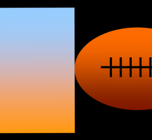
Unfortunately, a great many logos now-a-days seem to be nothing more then a drawing – devoid of any design stability. A drawing that shows part of the organization – or all of the organization at once – like the output of a blender. For example, I recently saw a “logo” on Facebook where the “designer” asked his Facebook followers to rate his new logo design. The logo was for a blog about beer and football – really, that’s all I know. The designer took a rather poor drawing of a beer mug and stuck it next to a rather poor drawing of a football. Instead of “keep it simple stupid” (kiss) it was more like “keep it stupid simpleton.”
If you want our logo to be done cheaply you will be doing your organization a disservice. Remember, “good design is not cheap, and cheap design is not good.”